
Lenovo Clean Your Device
A/B/C/D usability test | Clean Your Device (formerly Quick Clean) within Lenovo Vantage
A tiny feature with a huge misunderstanding — until UX made the value obvious.
Details

View more working details
Project Type
Research & PC App
Duration
6 months. Delivery November 2021
Tools
Adobe & UserZoom / UserTesting
Team
1 Product Owner, 1 UX Researcher
Design Digest
Design Digest
Clean Your Device is a Lenovo Vantage feature that temporarily locks all input so users can safely clean and disinfect their laptop without accidental clicks or actions. Originally designed for healthcare environments, the redesign transformed a niche medical utility into an intuitive, accessible cleaning mode for everyday users. Through iterative research and testing, comprehension improved from 66 % → 93 %, and the experience now ships to millions of Lenovo Vantage users worldwide.
Introducing Clean Your Device

Original design

Final design
To prepare for that rollout, a UX researcher and I began with a heuristic evaluation that surfaced 25 issues — mostly around system status visibility and accessibility risks in type scale and color. We then ran iterative user testing (~200 total participants) to evaluate redesign directions. Early testing revealed that only 66% of participants could correctly identify what the original interface was even supposed to do — confirming that the UI needed more than cosmetic refresh.
In later rounds of testing, we explored multiple redesign variants — including an illustrated “Drawings UI” direction that visually conveyed the act of wiping the device. That became the breakthrough: accurate understanding jumped to 93% at first interaction, and 93% of participants agreed the new UI was easy to use (vs. 81% with the original). Participants also asked for a “Cleaning Tips from Lenovo” section and more flexible timing, which led to adding the “Until I Unlock It” 30-minute maximum lock option.
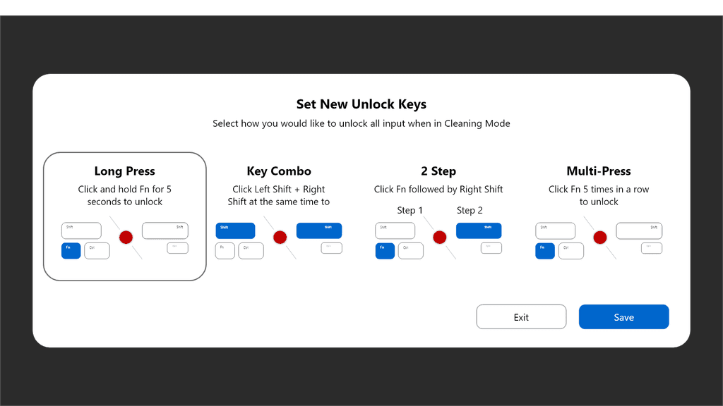
We also discovered that unlock preference was not universal: while most users preferred a key-combo shortcut, participants with motor-related disabilities were more likely to prefer a long-press — reinforcing that unlock should be user-selectable rather than one-size-fits-all.
The final redesign was renamed Clean Your Device — validated as a more accurate name — and handed off to development to ship inside Lenovo Vantage. Later, my colleague Mallory Shultz adapted the visuals again into Lenovo’s Cake design language. My contribution defined the clarity layer and interaction model that made this feature understandable to everyday laptop owners — not just healthcare environments.
Discover
Discover
Original Design
Countdown timer in set increments (1, 2, 3, 5, and 10 minutes) with combo keystroke to exit early.


Most violations were related to:
System status visibility was unclear — users couldn’t easily tell when inputs were locked, how long they would remain locked, or when they would unlock
Timer controls did not communicate duration, meaning, or progression — people saw buttons, but not purpose
Typography + color usage introduced accessibility friction — small type and weak contrast made it hard to distinguish active vs inactive states
Overall: users had to interpret the interface instead of understanding it
This diagnostic set the tone for the redesign phase: the problem wasn’t functionality — it was comprehension.
Define
Define
Clean Your Device worked as a feature — but it didn’t communicate purpose.
Users could not answer the most basic UX question: “What is this thing actually for?”
The confusion wasn’t about interaction difficulty — it was about intent. Without medical context, “locking the keyboard” was interpreted as a threat, not a benefit. Which meant the real value never even entered the user’s mental model.
Design Constraints
I could not change the fundamental function: the device must disable inputs temporarily while wiping — that behavior is required for safety
Timing / lock-unlock mechanics needed to remain consistent with platform constraints
Code changes were restricted; we could modify language, UI clarity, and user flows — not the underlying capability
Opportunity
The redesign needed to shift from what the system does → toward why this matters.
In other words: Instead of saying “lock your device," we needed to communicate “you can clean your laptop without accidental clicks.”
If users understood why this feature exists, they would value it more — and adopt it.
Design
Design
Once the core problem was defined — that the feature’s intent was not self-evident — the design phase became inseparable from research. Instead of designing in isolation, I designed through testing. Each iteration of the interface was treated as a hypothesis, validated (or invalidated) through structured studies, and then evolved again. In practice, this meant that “Design” was not a single static stage — it was an evidence-driven loop: design → test → learn → refine. The following research sections (Study 1 and Study 2) show how each prototype iteration directly influenced the next wave of design decisions. Each design change below is therefore not an aesthetic preference — it is a response to data.
1st Redesign: shorter timers + modernized styling
Internal exploratory testing suggested the original lock durations (1, 2, 3, 5, 10 minutes) were much longer than the wiping and cleaning behaviors most users actually do — especially outside clinical environments. So I reduced the preset time values to reflect more realistic day-to-day cleaning. At the same time, I applied a first-pass aesthetic refresh to make the UI feel more current and on brand.
→ This redesign made the feature feel better — but did not yet fix comprehension.

1st Redesign: Home screen


1st Redesign: Countdown
1st Redesign: Pick new unlock method

1st Redesign: Locked
Design testing and validation
I led the subsequent UX research and design studies, using Dr. Jojo’s heuristics as the foundation for multiple iterative studies. I ran two rounds of iterative user testing to compare the original interface to multiple redesign directions — including the final variant.
Study 1: 105 participants (13 dropped)
Study 2: 104 participants (7 dropped)
Both studies were counterbalanced to reduce order bias — each participant saw clickable prototypes in varied sequences to prevent anchoring effects.
Original Design

1st Redesign

Purpose
Establish a baseline and determine whether early design changes improved comprehension or if the problems were more systemic.
Method
Participants were shown the original interface and an early redesigned version in a counterbalanced order to avoid sequence bias. They performed tasks inside clickable prototypes and then rated clarity, perceived value, visuals, timer options, and unlock actions using 1–7 scale agreement measures.
Key Insights
50% of users said they would shut down their computer before cleaning it — a workaround that proves the behavior is real, but the intent of the feature was invisible to them
The redesigned interface was rated as more valuable and clearer than the original.
Participants showed only slight UI preferences across small visual differences — meaning incremental cosmetics alone would not solve comprehension
Unlock methods were not definitive yet: multi-press was disliked, key combo and long-press roughly tied
Outcome of Study 1
This study confirmed that the problem wasn’t merely visual styling — it was conceptual clarity. The redesign helped some, but not enough.
Which meant:
→ we needed a more dramatic reframe, not just polishing.
This directly led to Study 2 — testing a stronger, more metaphor-based visual change.
2nd Redesign: incremental clarity + structural refinement
With more appropriate timers in place and a modernized visual style, we refined the UI further to add clarity about the keystroke escape method and provided cleaning tips in the lower left corner. Other UI updates addressed key usability issues identified in the heuristic evaluation—particularly around status visibility, font scale, and color weight—but the conceptual framing remained largely text-driven.
The most significant change was renaming the application from Quick Clean to Clean Your Device, a shift that aligned the feature’s language with its actual purpose.
→ This redesign improved usability and clarity, but full comprehension still required reading.

2nd Redesign: Home screen
Changes:
1) Clean Your Device name
2) Keystroke sample image added


2nd Redesign: Countdown
Changes:
1) New cleaning tips in the lower left
2) Keystroke sample image added

2nd Redesign: Pick new unlock method
Changes: Instead of allowing the user to select anything, we offered a set of choices that could be illustrated for clarity.
2nd Redesign: Locked
No changes.
3rd Redesign, nicknamed Drawings UI: illustrated metaphor
The third redesign introduced explanatory illustrations showing the act of wiping the laptop while the inputs are locked. This gave the feature immediate semantic grounding — purpose became visually obvious, even at a glance.
→ This version is the one that broke the comprehension barrier: understanding jumped from 66% → 93% in testing.

3rd Redesign: Home screen
Changes:
1) Illustration added
2) Text clarified and condensed
3) UI re-evaluated for information hierarchy


3rd Redesign: Countdown
Changes:
1) Illustration added
2) Text clarified and condensed
3) UI re-evaluated for information hierarchy
3rd Redesign: Pick a new unlock method
No changes.
3rd Redesign: Locked
No changes.
Original Design
1st Redesign
2nd Redesign

3rd Redesign, nicknamed "Drawings UI"

Purpose
Evaluate whether a visual metaphor (Drawings UI) could solve the comprehension gap more effectively than incremental UI refinements.
Method
Participants again saw two interfaces counterbalanced: the second redesign vs the Drawings variant. They performed the same task flow comparison and rated clarity, usability, value, and preference.
Key Insights
Understanding jumped from 66% → 93% using the Drawings UI variant — this was the moment we broke through the comprehension barrier.
93% of participants agreed the Drawings UI and second redesign were easy to use, up from 81% with the original. The Drawings UI was the most preferred by participants for clarity, comprehension, and overall understanding.
Unlock preference divergence became significantly clearer:
While the overall participant population preferred a key-combo shortcut as the fastest “escape” method, participants with self-reported motor disabilities were more likely to prefer a long-press — because it required less precision and fewer simultaneous finger movements. This was an accessibility signal, not a stylistic preference.
Users also valued flexibility: 85% agreed they liked the indefinite “Until I Unlock It” option (max 30 minutes).

Participant’s accurate understanding jumped from 66% with the original to 93% with the illustrations from Drawings UI


Outcome of Study 2
This study validated the key UX changes:
use visual metaphor → not text alone
dual unlock methods for accessibility
rename to “Clean Your Device”
add the indefinite lock option
Study 2 wasn’t refinement — Study 2 was the breakthrough.
Research Applied
What we observed
50% of users said they actually shut down their computer before cleaning to avoid accidental inputs (real behavioral workaround)
Participants showed a statistically significant preference for redesigned visuals over the original (F(5,87) = 3.09, p = .013)
Unlock preferences diverged: overall users leaned toward key-combo, but participants with disabilities leaned toward long-press as more motor-accessible
And most importantly:
Understanding of the feature jumped from 66% → 93% when the Drawings UI variant was introduced.
This became the pivot point: the UI that showed the wiping behavior worked better than UI that simply labeled it.
This research materially changed the direction of the product.
From Research → Design Decisions:
Research signal:
Design action:
66% → 93% comprehension lift with visual metaphors
Adopt Drawings UI-style visual framing
Long-press preference among disabled users
Add accessible alternative unlock method
Value confusion rooted in naming
Rename recommended → “Clean Your Device” (validated language)
Shutdown behavior before cleaning
Emphasize benefit: "you can safely wipe without input"
Need for flexible lock duration
Add “Until I Unlock It” option (max 30 minutes) recommended
The data didn’t just support a direction — the data produced the direction.
Deliver
Deliver
Final redesign: Final shipped and integrated build
The redesign direction from this work was handed off and successfully shipped into Lenovo Vantage — marking the transition from “Quick Clean” into Clean Your Device — with the clarified visuals, renaming, and interaction models grounded in the research above.
This final iteration combined the insight-driven changes into one cohesive experience:
Drawings UI visual metaphor with added textual information
renamed to Clean Your Device
“Until I Unlock It” (30-minute max)
Cleaning Tips from Lenovo section
support for multiple unlock methodologies as findings emerged
→ this is the version that was handed off to development and shipped into both Lenovo Vantage and as a downloadable standalone app.
Vantage integration:
Clean Your Device can be launched within the Lenovo Vantage application.

Standalone app:
The feature is also offered as a downloadable standalone PC app.
Pick a new unlock method:
Countdown:


Indefinite lock UI:

Debrief
Debrief
The lesson: users don’t adopt what they don’t understand.
This project reinforced something I now treat as a core UX truth: clarity isn’t ornamental — it’s functional. When a feature is built for a high-context audience and then given to a no-context audience, the burden shifts onto the design to carry the missing context. The original version wasn’t failing because it lacked features — it was failing because it lacked framing.
The research proved that users weren’t confused about how to tap a timer — they were confused about why this feature existed at all. Once I redesigned from “inputs locking” to “you can safely wipe your laptop without accidental clicks,” understanding jumped and value perception followed.
And importantly — accessibility surfaced nuance we didn’t initially expect. Unlock method preference was not universal. Preferences diverged by ability profile. That insight ensured our future-state direction allowed multiple unlock pathways instead of assuming one default was universally usable.
So the takeaway I carry forward is this:
If the story isn’t clear, no amount of UI is going to redeem it.
The design must make the value self-evident — or the value might as well not exist.
If I were to continue this work today, the next accessibility improvement I would prioritize is giving users full agency over their preferred “escape” method — enabling them to select their own unlock action (key combo, long-press, or potentially alternative inputs) based on their motor ability, comfort, and preference. This would let the feature serve all bodies — not just the modal one — and close the loop on the signal we saw in testing.
Once the updated UX entered production, the feature later underwent an additional visual refresh into Lenovo’s unified Cake Design System language, led by my colleague Mallory Shultz, who evolved the UI styling for consistency across the platform. In other words: my contribution defined the functional clarity and interaction model that made the feature comprehensible and adoptable — and Mallory then subsequently carried forward the visual modernization into Cake, which Vantage adopted a number of years later.
Clean Your Device is now part of the Vantage ecosystem, reaching millions of Lenovo users, and the clarity gains achieved here are embedded in that shipped experience.
Cake redesign; current Vantage integration by Mallory Shultz:
